
Logo Design
I started creating logos for my friends as a hobby as far back as 2011, when I was only 14 years old. Many of the earlier logos were designed for short-lived group projects with friends, such as various YouTube channels. Some of the recent projects still exist to this day, like Game Paste, where my friends and I post film projects that we work on together.

The AnTi Clan (2011)
While the project itself may not be something I’m proud of today (a Call of Duty: Modern Warfare 2 clan consisting of several 14 year old kids is an easy recipe for embarrassment) the logo that I created, for being 14 at the time, is still something I’m proud of to this day. The objective was to take the traditional red cancel icon, and embed an “A” within it. The manner in which I did so still appeals to me today.

Delta Monkey Games (2012)
Another mediocre project: low-quality games designed by me and some other high school friends. We had no experience in coding or game design, and had even less education in either. This one, I will concede, is a less impressive logo. Still, it was a stepping stone along the way. The objective here was to take the rather… embarrassing original logo and make it more visually appealing. Obvious improvements I would make today would be to not save the logo as a JPEG. Look at those beautiful artifacts. What was I thinking?

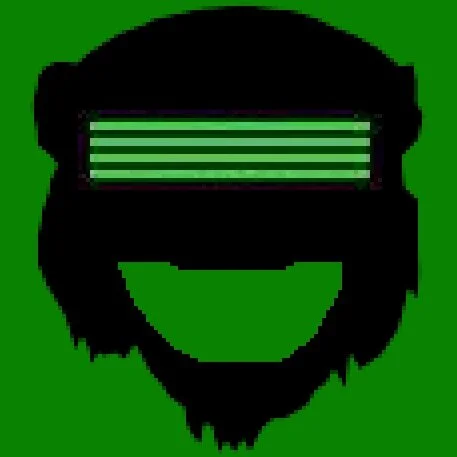
Game Paste (2017)
As I’d mentioned at the top of the page, Game Paste is actually an ongoing YouTube channel where my friends and I upload various film and skit projects, as well as some gameplay content. There’s a running joke among our group about how low quality our productions are; however, our works have improved drastically ever since two of the founding members studied film in university.
The logo concept was first proposed to me with a rather rough drawing, and I used that as a reference to create the final version.

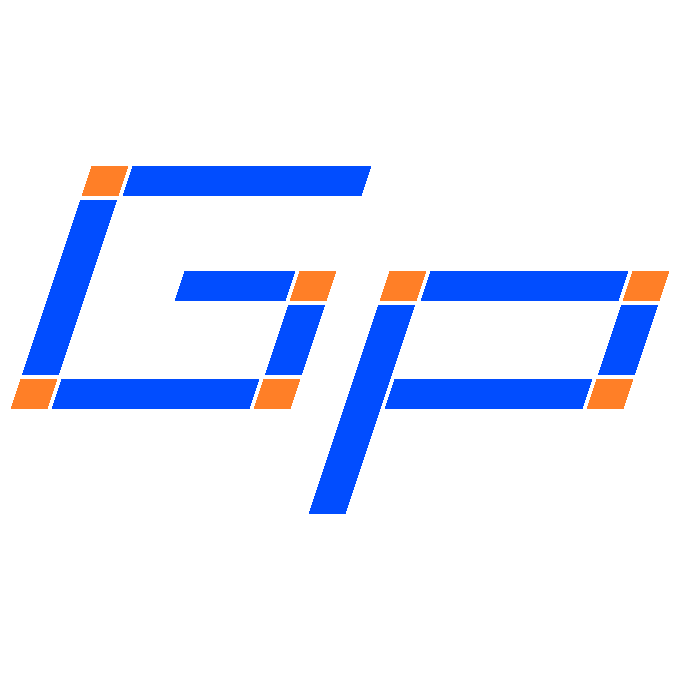
The original Game Paste logo concept
National Sitting League (2017)
A logo for an (unfortunately scrapped) Game Paste production. A relatively simple logo for a rather absurd video concept, but an amusing take on an American sports logo for a sporting event about sitting in chairs.
I won’t even attempt to explain how such a sport was going to work.


Taco Bell Logo Parody (2017)
I created this design as an inside joke with my friends from the Game Paste group. One member of the group is notorious for having made an absolutely massive list of items to order every time we went to Taco Bell, a frequent destination of ours.
Work on this image started when he posted a humorous photograph of himself holding a small plastic cup in his mouth. Using my knowledge of vectorizing an image, I was able to utterly transform the photo into these mimics of 2 different eras of the Taco Bell logo.
Aquos: The Water Streams (2020)
A very utilitarian logo to serve as the profile picture for the YouTube channel which hosts archives of my Twitch livestreams.
It’s important to keep in mind how small a YouTube profile picture will usually be, and making all the elements visually apparent and readable at a small size is essential to a good profile picture.
That being said, definitely not the most impressive work of mine.
